Restaurant website design
Vera Sushi
Let the food make the first impression.
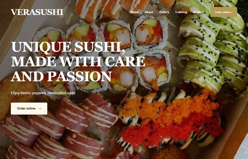
A restaurant website should make people want to explore the menu. This design gives sushi photography the main stage, supported by clear navigation and a warm, welcoming visual style.
The design approach
A large food image introduces the restaurant immediately. Compact navigation keeps the choices manageable, while contrasting text and buttons make the next step easy to spot.
On a smaller screen
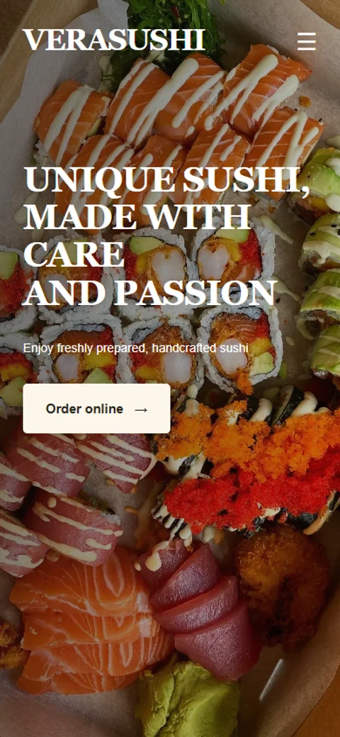
The smaller layout keeps breathing room around the title, navigation and main action. Food remains prominent without squeezing the information against the edge of the screen.
The portfolio previews use English presentation text. The live restaurant website is in Dutch and may differ from the previews.
A closer look on mobile
A website with your own look.
Take a look at the packages, then tell me about your business.